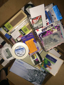
 Some of the art supplies I bought last winter while in Florida. I have yet to use most of them! Some of the art supplies I bought last winter while in Florida. I have yet to use most of them! I am not a hoarder. At least not by TV show standards. I do have a lot of art supplies, partially due to the fact that I keep getting attracted by new mediums and techniques. And it’s not that I have too many art supplies, it’s that I don’t have enough space for them!
It is some comfort to know that I am not alone in my addiction to art supplies. Many of my art friends, as well as Youtube artists that I follow, openly admit to their addiction. During online art demos, viewers want to know what brand of brush or paper or canvas the artist is using, convinced that if they themselves used that brush or paper or canvas, their own work would be magically improved. People gloat on social media about the latest color of So&So paint they just bought, bringing their collection to 257 colors! Manufacturers know this. Art stores know this. They create “clubs” with loyalty points to keep you coming back. They send you enticing emails at least once a week to let you know what you now need. I used to think like that. Thankfully I have learned to mix colors from a few basic ones, so I don’t fall into that trap. Much. Except for pastels. It is much harder to mix colors effectively in pastels, so I do need to keep adding colors to my collection. But I still have a lot of stuff from the “old days”. And new stuff that I already bought but have yet to try (that photo above shows a lot of that!!). And old stuff that might come in handy someday. I learn a lot of my craft by watching YouTube videos, so I see the inside of a lot of professional artist studios. Most are cluttered, but also organized. I am always amazed and somewhat comforted to see the quantities of stuff all over the place in these studios. I must be an artist! But I also get a bit of storage envy when I see all their wonderful shelves and custom-built storage units! I keep dropping hints that the basement would be a great place for a bigger studio, but up to now they have fallen on barren ground, or deaf ears, or whatever metaphor you want to use. That’s OK, sometimes these things take time. In the meantime, I have to make do. I am grateful that I even have a studio, as many of my artist friends have to be content with a corner of their dining room table to make art. I am very lucky in that I have a dedicated room, not large but sufficient really, plus a recently reallocated storage cupboard just outside the studio. If I could eliminate one or two mediums it would definitely be enough. But now, with printing having been added to the mix, space is really getting tight. I can only dream of getting a printing press some day, but right now I don’t really need one, because it would definitely have to go in the basement, if only because of the sheer weight of it! If and when that day comes, maybe I could do my printing in the basement and everything else upstairs. Having limited space can be seen as a good thing. It forces me to make choices. For example, I could choose to no longer do any of my framing myself. In addition to taking a lot of time, this takes a lot of space, because I have to stock frames and mats, both cut and uncut. I also don’t have a large enough surface in the studio itself to actually do the framing, except for the smallest pieces. So I have to lug things down to the dining room table where I can spread out and cut mats and frame the work. Besides enjoying the process and helping to keep the cost of my work down, I choose to mat and frame my own work because I can then control the timing of it. I don’t want to have to take my work to a framer then be at their mercy as to when I get it back! I don’t work that far in advance! But it does mean that I have a stash of recycled frames that take up space! I could clear a bit of space by getting rid of a lot of beginner level books that I bought years ago when I was just starting. They are fine books, but I don’t consult them any more, and someone else could use them. I will have to look into that, but it will at most clear 1-2 cubic feet of space…. just enough for my printmaking supplies…. for now anyway…. So, if you would like some free books on how to learn watercolor, or if you happen to have an old but functional printing press, you know who to call!
0 Comments
 Image source: onepicnowords from Pixabay Image source: onepicnowords from Pixabay Ever since I started painting seriously, and even when I was just painting for myself, framing has been top-of-mind. Because watercolor paint is rewettable (unless it is varnished or waxed of course), paintings must be protected if you have any hope of preserving them for any length of time. The standard way to do this is framed behind glass, with an acid-free mat or mount between the glass and the actual painting. The mat serves many purposes: it gives the painting a nice crisp edge, it increases the visual size of the watercolor, it may enhance the painting by repeating or contrasting with the colors used in the painting, and it ensures the painting doesn’t touch the glass, which could lead to permanent damage. The glass itself protects the painting from outside elements; it can be acrylic or glass, and comes in various quality/protection levels, particularly for U/V protection and glare. Acrylic is lighter but prone to scratching, so glass is most often used.
Framing can be very expensive. Custom framing, where a professional helps you choose the mat and the frame, and builds it to fit your painting, can easily run into the hundreds of dollars, even for smallish frames. Standard frames come in fixed sizes and are much more affordable than custom frames, although there is of course less choice of designs! To me, a frame is a very personal thing. Some people like fancy, traditional frames, and others prefer simpler, modern frames. Most like a mixture of both, depending on the artwork. For example, an old-fashioned pastoral scene would probably look better in a traditional frame than in a modern one. For paintings that I show framed, I try to keep to a standard minimalist look to keep things simple and not distract from the artwork itself. When I discovered the cost of framing (my frames would actually be more expensive than the artwork!) I started looking for alternatives. Being thrifty, as you know by now, and also wanting to keep my art affordable, I started looking for good-quality frames in second-hand shops or yard sales. I was quite successful in searching out gently-used, mostly simple silver or black metal frames, and soon built up quite an inventory, which would allow me to switch out broken parts from frames too damaged to use as is. I learned a lot about frame types and quality, what to look for and what to avoid. If you own any art bought from me before 2021, chances are excellent that the frame is one that was saved from the landfill! I must say that is one aspect that I really like about reusing frames, the other being that each frame I can re-use keeps a new “made-in-China” one out of circulation. Now that my art is a bit better and my prices are a bit higher, I have started occasionally using new frames, which of course I never pay full price for! I also have started offering matted but unframed work in standard sizes, so the buyer can choose the frame that suits them. It also helps to keep my prices down, and makes transporting, storing and even shipping that art much easier! I either cut my own mats or buy precut standard sizes, again to keep the costs down. I have yet to have one of my paintings professionally framed! For oil paintings, framing is different. There is usually no glass involved, as the oil paint does not need the same level of protection. I have less experience with framing oil paintings, and tend to prefer the simple modern look of the “floating frame”, which is a very simple border that is separated from the actual painting, leaving a space that makes the painting look like it is floating inside the frame. My darling husband has been making them for me on an as-needed basis, so I guess I could say I have my own personal custom framer! How lucky am I ?!? If you have some old frames collecting dust (let's face it, they all do, but I really mean 'not being used'), or if you know of any good sources of gently-used frames, do let me know! Thanks! 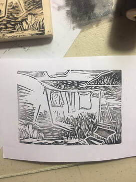 My very first attempt at a linocut! Not perfect, but not bad! My very first attempt at a linocut! Not perfect, but not bad! If you have been following me at all over the last 2 years, you will have figured out that I like experimenting. Really though, I love learning new things. So what is the latest thing that has captured my attention? Block printing.
I hear you. What is block printing? It involves creating and cutting out a design on a surface, which could be linoleum (lino) or some similar rubbery surface, or on wood, then applying ink to that surface, then pressing it onto paper, or possibly cloth, leaving an imprint of the design. There are many variations to that general process, and in my case (so far!) I will be using the softer “lino” surface and hand-printing with black ink on watercolor paper. Then I will (that’s the plan!) use watercolor to color some of the elements of the design. The first reason I thought of doing lino prints was to make series or editions of Artist Trading Cards (ATCs). Up to now, all the art cards I have made are for sale, so they are called ACEOs (Art Cards, Editions and Originals) and they are all originals. I feel strongly about originals, but I wanted to also have some art cards available for trading. The trouble with my ACEOs is that, because they are originals, they take as long to create as many of my larger-sized paintings. But I can’t very well expect people to pay large-size prices for tiny-sized art, so I have priced them, in my opinion, very reasonably. By simplifying part of the card’s creation, I could print out many similar cards and then color each individually, making them still originals but quicker, and therefore even less expensive, to produce. So that is how it started. But now I am thinking bigger. I really like the look of a lino print, whether it is just the pure black and white ones, or those with some color applied. It is possible to print in multiple colors, but that is not where I am going. For now anyway. I tried to identify what it is that I like about lino printing. I really like the black and white, and I also like the “finished but unfinished” look of the printed parts. Lines are crisp, but edges aren’t always perfect. Each print is the same, but upon close inspection is different. I really like the idea of continuing to use watercolors in this new exploration. I may try to integrate other mediums such as Sumi-e ink to do the actual printing. I also like the idea that I will be able to use up some of my stock of watercolor paper. I like the fact that I (actually my husband) already had most of the tools, so the need for new supplies is minimal. I like the sculpting aspect of this technique. I like the slow, methodical, almost meditative process. I also like the moment when you "pull" the paper and reveal the newly minted print! There’s a lot to like! So I will be experimenting with this medium for the next little while. I plan on making a few series or limited edition prints that I hope to be able to sell for less than a same-sized watercolor, thus helping me in my mission to get more original art into people’s homes. I already have some ideas for upcoming prints, where the design would be the same but the colors would be unique to each piece. If you have ideas, I would love to hear them. Or leave a comment letting me know what you like about lino prints? 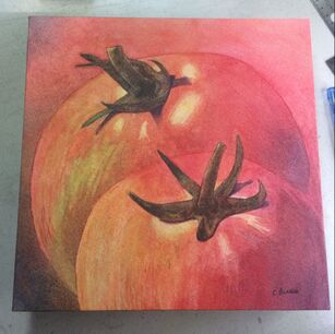 "T'as ma toast", waxed watercolor paper on wood cradle board, 10x10x1 "T'as ma toast", waxed watercolor paper on wood cradle board, 10x10x1 A few weeks ago, I had an idea for a painting. I needed one that would fit in with the theme of the upcoming art show, which is “À table”, which can be loosely translated as “Let’s eat”. When trying to figure out I could use this theme, I had this vision of a couple of tomatoes seen from up close. I also wanted to get back into poured watercolor, so this project could serve both purposes.
I did a few pencil drawings (thanks to the composition course I recently took) to work out the composition and settled on one. I enjoyed painting it, using only three primary colors and masking fluid, applying each in many layers to achieve the desired forms and colors. It’s a long process, but it’s great to see the painting slowly appear. I described the watercolor pouring process in more detail in this past blog entry. If you are wondering about the painting's title, it is a tribute of sorts to a french "kid joke" my daughters liked when they were young. About a tomato, a potato and an onion. It isn't very funny, and can't really be translated, but the humor resides in the fact that the words in it kind of sound like the English word for tomatoes, potatoes. and onions.... yeah... kids! Because of its more abstract nature, I wanted to frame this painting in a modern way, finishing it with wax rather than the more traditional frame and glass. So I had planned to adhere the finished watercolor to a cradled wooden panel (10x10x1), wrapping the edges of the painting around the cradle, as you often see with gallery canvas in oils or acrylics. I had adhered watercolors to panels before, but had never tried wrapping the edges. Indeed most waxed watercolors I have seen, and all those I have done, are trimmed along the edges of the board after they are adhered, but I had never seen a wrapped one. I of course searched Youtube to find tips on doing this, but found no examples of what I wanted. There were instructions for wrapping a sheet of watercolor paper on a canvas before painting, but my painting was done at this point! I asked the members of the Waxed Watercolors Facebook group, but no one had tried this. That began to worry me, as I assumed there had to be a good reason! The main concern I had was that the paper would break along the folds, as it is relatively thick, and is, of course, just paper! I did a few tests with some scrap watercolor paper and found that scoring the back of the paper, like when you want to make a neat crease when making a card, was just the ticket! It gave a very neat fold, and relieved the stress on the paper so it would not crack. It took a bit of time and a few items borrowed from my husband’s workbench, as well as a bit of planning, but I did it, and I am very happy with the results! I hope you agree! But, and there’s always a but, when I checked the website for the show to get the entry deadline, I was extremely disappointed to see that the pieces entered had to be at least 150 square inches! This one, at 10inx10in, was sadly too small for the show! I don’t know if this requirement had always been there, but I obviously hadn’t noticed it! So now I have a very nice painting, specific to a theme, which I can’t put in the themed show! Thankfully, this is the same show in which I have a solo wall, with MY rules and MY requirements! So it will be in the show! Now I just have to paint something else for the main show. I have 10 days, and an idea.... |
AuthorMy name is Claire Bureau. Archives
March 2023
Categories
All
|
 RSS Feed
