|
This is the fourth instalment in my series describing how I create a painting. These are the steps I usually follow for full size paintings, and it may be different from your process if you paint. This week’s topic is: Painting in oils or in pastels Last week I covered how I paint in watercolor. I have been doing that for about 15 years now, so I have tried many techniques and have become quite comfortable with a lot of them. I only started painting in oils last summer. and pastels even more recently, so I still have a lot to learn!! I mentioned that I use a limited range of colors in watercolors, mixing colors as I need them. I have an even smaller number of colors in my oil paints, having only primaries and a few favorite dark colors, and white of course. Whereas water (and the white paper) are used to lighten watercolor paints, white paint is used to lighten oil colors, and black is used to darken them, although my knowledge of mixing colors has helped me avoid using much black so far. I never thought I would paint in oil, mainly because of the mess and smell and toxicity that I associated with oil paint. Then I discovered that many manufacturers offer water-soluble oil paint! This seemingly impossible product is achieved by modifying the oil or by adding an emulsifier to it, rendering it water-soluble. No turpentine or solvents needed! This, and a number of demonstrations by oil painters which I began to watch online convinced me to try this medium. The process is very different from watercolor, so it is quite an adaptation for me. Oil paint is much more forgiving than watercolor, in that mistakes can be simply scraped away or covered with more paint. Whereas watercolor requires a relatively precise pencil drawing of shapes and objects, in oil painting, objects and shapes can be positioned approximately and progressively refined by painting either the objects or the space around them. The layering/mixing of the colors on the canvas is also something that is impossible to do in watercolor; oil paint is usually applied from dark to light, completely the opposite of watercolor. Also, because of the thickness and texture, oil is a very sensual medium to manipulate. But it can also be quite difficult to get the paint to move off the brush and to stay on the desired spot, especially in small details. As I mentioned, I have watched many videos of painters that make it look a lot easier than it is!! I am still learning, so I haven't gotten into using mediums that affect the texture or drying time of the paint. Drying time! Although the slow drying of oil paint allows reworking and on-canvas mixing effects, it is also the biggest drawback to painting in oil. While some paintings can be completed in one session (this is called “alla prima”), often they are the result of several days of painting, with drying time in between layers of paint. An oil painting can take years to complete! The longest I have spent so far is about 2 weeks. And then the paint is not really dry, more like tacky. It can take 6 months to a year for a painting to dry enough for the next step… which we will cover next week. There are two types of pastels, oil and dry. The ones I use are the chalk or dry pastels, and they are similar to oil paints in that they are forgiving. Pastel can be removed or erased from the paper, and it can also be covered or layered, and you work dark to light. They require few tools or mediums. They come in varying degrees of hardness, from hard to extra soft. They are basically pigment mixed with very few additives and compressed into fragile sticks which are rubbed onto the surface to release a layer of pigment. They are dusty and don’t really want to adhere to the paper. But they cover quickly and give interesting results. The process of painting in pastels (it is called painting although it is much more like drawing or coloring) is similar to oils: you start by lightly drawing in pastels the general position of objects on the surface; you can then block in these shapes, then continue to refine them by adding more pastels. Unlike oils, you are limited to the number of layers you can apply before the pastel just won’t adhere, so you can’t keep adding color to correct mistakes. Using a workable fixative will allow a few more layers, but there is a limit, so you have to paint more carefully, or scrape off mistakes rather than just cover them like you could with oil. Another difference is the number of colors you need. Although different colors can be obtained by blending, the look of blended pastels is very different from non-blended, so you need a large assortment of colors and tones (light to dark) of each color. Some high end ($$$$) pastel sets come with over 400 different colors! There are a few techniques that are specific to pastels, such as blending, feathering and dusting, but a lot of knowledge gained in other techniques can be transferred to pastels. You can also mix watercolor and pastels, but I haven’t tried that yet. One thing that is very particular to pastels is the paper, especially sanded paper, which is actually like very fine sandpaper and is supposed to hold color very well. I have bought some but I have yet to try it! I am very much a beginner in pastels, so I can’t really say much more than that for now. As someone who works very precisely(tightly) in watercolor, I enjoy the spontaneity(looseness) of pastels, and I very much admire people who produce very precise work in pastels. I have no idea how they do it! Yet! Next week I will look at the post painting process for watercolors, oil and pastels.
0 Comments
This is the third instalment in my series describing how I create a painting. These are the steps I usually follow for full size paintings, and it may be different from your process if you paint.
This week’s topic is: Painting in watercolor The actual painting process depends greatly on the medium used, so this week I will cover only my watercolor process, and deal with oils and pastels next week. Many painters will do one or more "studies" before attempting the real painting. Unless I will be using a technique for the first time and want to try it on a smaller scale first, I will usually just jump in and do the painting! If it doesn't work out, I will only then call it a study ;-) After the detailed pencil drawing on the watercolor paper is complete, and the masking fluid, if used, is dry (this was described in last week’s blog) I will usually sit and think about how I will paint the painting. As I have mentioned previously, watercolor is an unforgiving medium, so a few minutes developing a plan of attack is time well spent. I will contemplate what techniques I will use for what parts, what colors I will use (I may do a few swatch tests if I need to mix a color), what parts I will do first, what brushes I will need, etc. I will sometimes start with a pale wash to get rid of the white paper, except where it must stay white, of course! I usually work with the paper flat, but some watercolor artists will work on a slant, allowing gravity to pull the color down the painting. I will rotate the paper during the painting process to whatever position is easiest to paint the section I am working on. In watercolor, we paint from light to dark, so you look for the lightest colors in the image and paint those over entire areas first, for example paint an entire field with the lightest green or yellow in that field, then add layers of darker paint to slowly complete the picture. In other cases, it might be better to paint a section in darker colors and to then remove some of the paint to reveal lighter tones, like the highlights in folds of cloth. This is called ‘lifting’, and it can really help give the illusion of shape, but too much or too vigorous lifting can damage the paper and ruin a painting. Lifting can be done with a variety of tools, depending on the desired effect: a damp brush, a special scrubbing brush, a tissue or paper towel or a sponge are commonly used. It is difficult to add more color layers without creating hard lines on the edge of the new color when it dries, so lifting gets around that problem and leaves very soft edges.
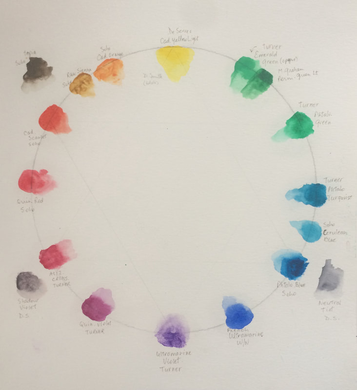
About a year ago, I adopted the color wheel suggested by painter and author Steven Quiller, which has only 12 colors (3 primaries, 3 secondaries, and 6 tertiaries). I have added a few dark colors that I use quite a bit, but all other colors, including some beautiful blacks, are achieved by mixing the 12 basic colors in varying proportions. I find this simplifies the decision making and reduces the number of paint tubes I have to buy! I have a set of dry or pan watercolors which I can take with me to my painting groups or when I travel. In the studio, I have a Quiller palette in which I use tube watercolor paint. I have a good assortment of paintbrushes, including some vintage sable hair brushes that were given to me by a painting coach I had for several years in Florida, and who sadly passed away last year. When I first started painting, I used very cheap brushes, but when I bought some good ones I was amazed at the difference it made in controlling the placement and the amount of paint the brush could carry. I paint mostly with small brushes, so the point and “springiness” of the brush are very important. I have a few ‘specialty’ brushes but mainly stick to rounds and a few flats.
There are many techniques that can be used in watercolor. These include lifting as mentioned previously, but also charging, glazing, blending out, gradients, dry brush, scraping, scoring, etc. You can paint on dry paper or you can paint on wet paper. You can also get special effects by using salt, alcohol, plastic wrap, gauze, etc, but I don’t often use these. Watercolor paint dries fairly quickly, but can be aided with a hairdryer if needed. On the other hand, if your paint is quite wet, you can also tilt the paper to make the color run to create other effects. So, depending on the painting and on the effects desired, I will usually use a variety of techniques in one painting. Because some techniques depend on the current level of dryness of the paint, some of the decisions on which technique to use must be made before I start to paint, and in some cases once begun, they can’t be interrupted. In watercolor, failing to plan really is planning to fail! Watercolor dries quite a bit lighter than it looks when it goes on. This makes it difficult to properly judge how light or dark a color will be, especially if it is applied next to an already dry section of the painting. Experience helps here, as the color will usually look fresher if you get it right the first time rather than to have to come back and give it a “second coat”. Once the painting is complete and the paint is totally dry, I will use a rubber cement pickup tool to remove the masking fluid, then will work on the preserved white areas if needed to blend them into the painting. I may also use a razor blade to scratch some very fine white areas back, such as a cat’s whiskers or tree branches. Sometimes, I will do what is called a “pen and wash” which is a watercolor painting in which some of the lines are drawn in pen. I love the look of pen and wash, and I really don’t know why I don’t use it more often. The pen lines can be added before the watercolor, or after. If done before, it is critical to use a waterproof pen, unless you want the lines to be blurred, which can also have a nice effect. So many decisions!!
Once I am satisfied that the painting would only get worse if I kept working on it, and if I deem it a "keeper", I sign and date it, usually using a dip pen with watercolor paint in one of the dark colors used in the painting. If it isn't a keeper, I will store it with its brothers and sisters and look at it again later to remind me of what I did wrong, and if I know how, I might attempt to fix it. The actual painting stage could have taken a few hours to a few days, depending on the size and complexity of the image. But we aren’t quite done yet! In two weeks I will cover the “post-painting” steps, and next week I will describe the painting process for oils and for pastels.
This is the second part in the series on how I create a painting. Like I said last week, these are the steps I usually follow for full size paintings. This is my process, and it may be different from yours if you paint. There is no recipe for painting, or right way or wrong way, as each artist brings their experience and preferences to the process. It is also something that can evolve, but this is how I do it, in 2020. This week’s topic is: Working out a plan After deciding on the subject of the painting, the next step is to decide what medium I will be using. This used to be a simpler step, as I only worked in watercolor. But you may remember that I started using oils as well as chalk pastels during the pandemic, so now I have an additional decision to make. The choice of medium has quite an influence on my process, because watercolor is much harder to correct than oils or pastels. You can correct small things, but once watercolor paint has touched the paper, it never can be completely removed. You can paint dark colors over lighter ones, but you can never get the white back, and unlike in other media where you can use white paint, in watercolor, the paper is the white paint, so once it’s gone, it’s gone. Some people use white gouache, but it will never look the same as the virgin paper. I will occasionally use a white gel pen for very small white specks, like the sparkle in an eye, for example, but I avoid using white gouache. One way to make sure certain parts of the paper are kept white is by using masking fluid, which is a rubbery liquid that can be applied before painting and that, once dry, will prevent the paint from reaching the paper underneath. But this requires planning! So watercolor in general requires more planning than other media. Whatever the medium I have chosen for this new painting, and unless I find that the reference photo is already a perfect composition, I will usually do a few quick pencil sketches to work out the best composition or placement of the elements of the painting in relation to each other as well as to the edges of the painting. This has to be done following the same proportions as the painting, so the size of the painting will also have to be decided, depending on what paper or canvas boards I have available. I may also take into consideration what frames or pre-cut mats I may already have that could be used to frame the finished painting. No sense making a wonderful painting only to find it won’t fit in standard frames! Custom frames are an expensive option I would rather avoid! So again, planning is key! Depending on the medium to be used, the surface has to be chosen next. Watercolor paper comes in different surface types, from smooth to rough, depending on the effect the artist wants. The best papers are actually made from cotton rag, not wood pulp! Watercolor paper is usually white, but the white varies from one manufacturer to another, and some manufacturers offer different brightnesses of white! Most watercolor paper is machine made, but there are some beautiful handmade papers available. Although watercolor can be used on other surfaces, I have only tried a plastic paper called Yupo, which I didn’t like. Watercolor paper can also be used for dry or chalk pastels, but there is also specialised pastel paper, which comes in different colors and finishes, depending on the effects wanted. Oil can be painted onto a variety of surfaces, including special oil paper, canvas sheets, canvas boards, stretched canvas, wood panel, masonite, etc.; canvases come in different textures, from smooth to rough. Whatever surface or medium is chosen, the most important thing is that it be archival, which means it will still be around in 100 years or more. Once the size, composition, medium and surface are decided, it’s time to transfer the drawing onto the surface. For watercolors, a light but detailed pencil sketch is usually required, mainly because you get one chance at getting watercolor in the right place. You can erase pencil lines if they are wrong, but you can't erase watercolor. This drawing could be done freehand, or using a grid system on both the original and the painting surface to reproduce the image as faithfully as possible, or by tracing, or by projecting the image on the paper and tracing it. I have used all of these methods, and the choice is made case by case. If necessary, scaling the image up or down is also done at this time. Large areas of white are easy enough to leave untouched during the painting stage, but if I need small areas to be preserved, I must apply masking fluid to those before starting to paint. This can be applied with a variety of tools, but usually not with a brush because masking fluid dries rather quickly to a rubbery mass, and if it dries on a brush it will ruin it. Many artists stretch their watercolor paper so that it doesn’t buckle when they start painting, but I generally don’t use that much water in my style of painting, so I don’t find I need to stretch it. Unless I leave it in the pad or block that it came in, I may tape the paper to a rigid board with painter’s tape to make it easy to pick up and turn in whatever direction I need to while I paint. The tape also can give the painting a nice clean edge. For oils and pastels, although you can draw the main elements with pencil, it is usually done with the medium directly, and in a very general way. Because it is easy to cover mistakes with more medium, a detailed drawing is not really necessary. An approximate position of each element (sometimes called a block-in) is sufficient to get started, and this can be done either in a single base color (brown or grey for example), in the actual color of each element, or in its complementary color. As the painting develops, you will refine the shapes with more medium until they look like you want them to. So with this base step completed, we are ready for next week’s topic: the actual painting! See you then! I hope you are enjoying this series. Please post comments or questions in the comments section below! NOTE: I am experimenting with adding an audio version to this blog. Click the link below to download and listen. Let me know what you think in the Comments section below!
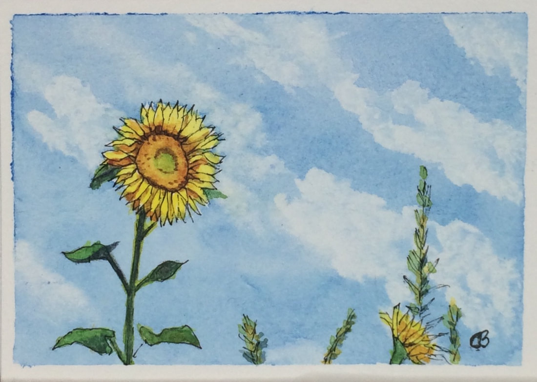
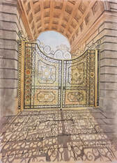
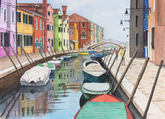
Today I am starting a series on how I create a painting from concept to hanging. I am going to concentrate on how I create full size paintings, because the process is not quite the same for creating the smaller ACEOs (remind me to write about those some day!!) This is my process, and it may be different from yours if you paint. There is no recipe for painting, or right way or wrong way, as each artist brings their experience and preferences to the process. It is also something that can evolve, but this is how I do it, in 2020. This week’s topic is: Where do I get my ideas? Great question! Most of the time, I will not be looking for an idea, but I will see a scene or a photo that will trigger my “oooh, gotta paint that!” reflex. If it's something I see myself, I will take a few photos to work from later, such as the "Sunset on the Oxford Canal" below, which is from a photo I took during our Canalboat holiday a few years ago. 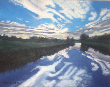 Sunset on the Oxford Canal, Oil I am part of a Facebook group called “Photos for Artists” where some very talented and very generous photographers place photos for free, encouraging artists to use them as inspiration, and asking only that they be mentioned as the source of the photo when posting the completed painting. My paintings “Sea Dreams”, “Old Church”, “Chatsworth Gate”, “Un Canale a Burano”, “Mûres Réflexions”, and many others are painted from photographs from this site.
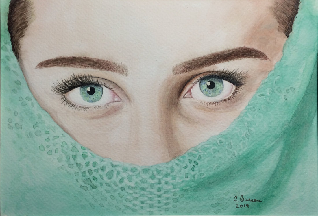
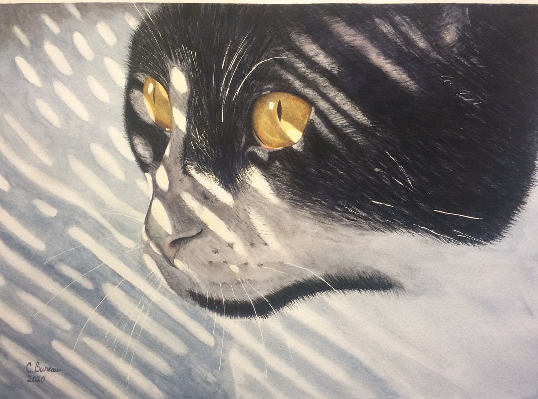
About a year ago, an artist friend introduced me to Pixabay, which is a similar free resource, but with many more entries and with the added bonus of being searchable. “Green Eyes”, “Winter Eyes”, “Mishka” and “Alley Cat” are examples of paintings using Pixabay photos. Those last two were found by searching for “shadows”, which I particularly like painting.
When I am looking at photos to paint, I most often will be searching for that “wow” image. I know many artists will collect dozens of different photos and assemble them into a painting, but I tend to look for the “perfect” photo. I will occasionally remove or modify the position of something, but the composition is pretty much there already.
Sometimes I will get an idea for a painting. It will usually just come out of the blue, for no apparent reason. Until recently, I would usually manage to forget that idea because I didn’t write it down, but now that I am using Airtable to track everything, I can add it to my “Ideas for Paintings” table through the app on my phone! That is how the “Black and White #1” painting came about. I might do a series of these, then again I might not. This week I happened to watch a 1954 interview with the famous 20th century artist Marcel Duchamp, in which he summed it up nicely: he said that he wanted to paint what he wanted to, not what others thought he should be painting. My list has about four ideas right now, enough to keep me busy for a while, and it is comforting to know I won’t forget them and can add new ideas any time! About 10% of the time, I will try to make an image from imagination. I don’t have many examples of this because I am not very good at it. I know I should spend more time doing it in order to improve, but I don’t enjoy this as much. Obviously the few abstract works I have done are my own creations, and the most recent one I did (“Black and White #1, not yet available) was much more geometric, and I did enjoy that a lot. Perhaps that is something to pursue… but there is never a shortage of things to pursue for an artist!! Of course, when someone asks for a custom painting, the subject or idea is supplied to me, usually as a photo or series of photos, but I will still discuss the treatment with the person commissioning the work before starting. This could involve the background, the colors, the mood, what to include or not, etc. Next week I will look at: How do I get started? Last week I read the book “Steal Like an Artist”, by Austin Kleon. It is ironic that the book is actually a copy of an article the author wrote following a talk he gave to students, and also available as a TED talk. Perhaps also ironic is the fact that I read it online, therefore depriving the author of any revenue. The author probably wouldn’t mind, as his message is pretty much ‘share freely, everything we do is basically a mashup of things we have picked up along the way’. He even wrote a second book, which I also read online at OpenLibrary.org, called “Show Your Work”, which basically tells creatives they should be very generous with their processes and discoveries, which a lot of people do. In fact, much of what I am able to do today artistically is because of the generosity of other artists teaching their craft online for free. I confess to not being very generous that way, and I will try to remedy that in the future. But that is not today’s topic, just a long winded intro! My original idea for this week’s blog was to try to explain copyrights in art, and these recent readings just complicate things further! Regardless, I will try! What is a copyright? A copyright is literally, the right to copy. This right applies to creative work, including books, visual art, music, poetry, films, fictional characters, etc., and it belongs to the person (or company) who created it. It lasts a certain number of years, depending on the country, but usually many years past the death of the creator. It can be ceded or sold, but only overtly, in other words, you should assume the owner is the creator unless there is proof otherwise. The copyright gives its owner the sole discretion as to what can and can’t be done with the work, for example if copies can be made or if it can be used as a basis for a transformed work (say turn a book into a movie, or use a character in an image or book). The owner is the only one who can give permission and can negotiate compensation for the use of the copyrighted work, which of course is the underlying idea here: giving credit where credit is due. Important to note, a copyright can’t apply to an idea, but only to the expression of the idea; for example, a duck can’t be copyrighted, but Donald Duck can. How does one ‘record’ a copyright? In its simplest form, a copyright does not need to be registered, but is often identified by the © symbol followed by the creator’s name and date. That’s it! In practice however, if a creator has to prove ownership if they find one of their creations has been ‘stolen’, that may not be enough. In a dispute, the creator has the burden of proof, so manuscripts or photos of work in progress will help establish that they indeed created the work. Most creatives do not bother to register their copyrights, but large companies such as Disney, where most revenue comes directly from creative work, have entire legal departments whose job is to make sure only Disney profits from Disney designs. Are there times when copying is legal? Copyrighted material can be used without express permission in certain circumstances, such as in a critique or a parody, or in academic work, as long as proper credit is given to the owner of the copyright. In painting, a practice known as “master copying” is often used as a way to learn to paint like the grand masters. The artist should never try to pass off the work as their own and should not sell the copied work. They usually will sign the work “after XXX”, where XXX is the name of the master painter. In 2001, Creative Commons came along to muddy the waters of what can and can’t be done with original work. Under Creative Commons licensing, the creator can choose from a combination of share/reuse options going from “not at all” to “in some cases”. Their aim was to make it simpler for creators to share their work under some circumstances. Creative Commons uses a different and complex set of symbols to identify which combination the creator chose. You can see an example in the bottom left corner of this great diagram made and shared by Ginger Davis Allman from https://thebluebottletree.com/ 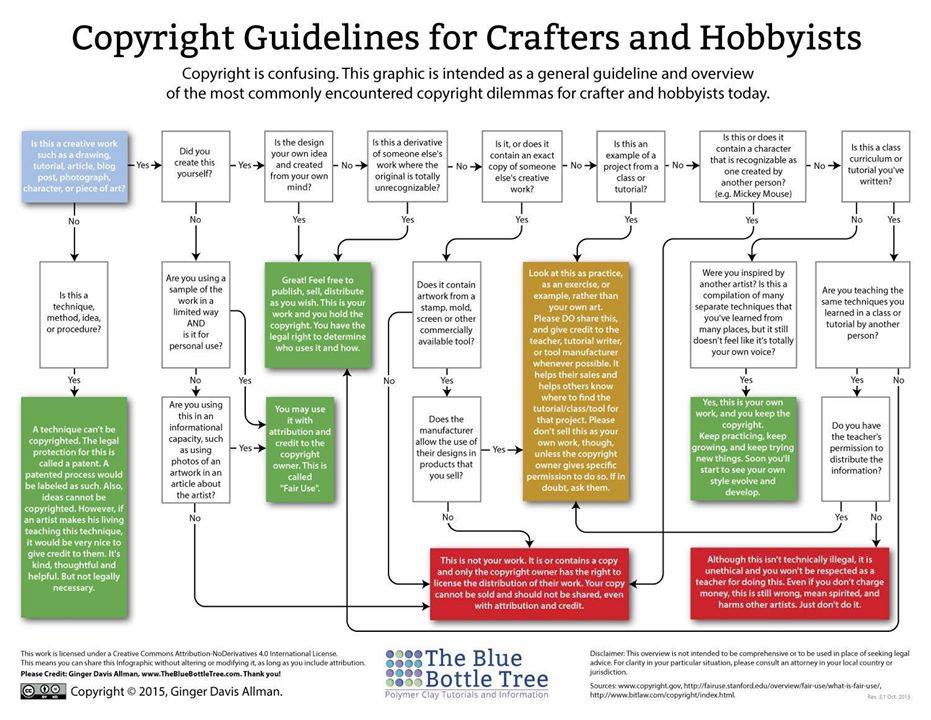 What are the odds of getting caught?
On Facebook recently, I saw a Quebec art gallery showing paintings for sale which obviously used well known Disney characters. Although I have no doubt they will find buyers, I would not want to be them or the artist if Disney comes calling, as I very much doubt they gave a Quebec artist express permission to use likenesses of Mickey and Donald! Possible, but not likely! I know from other creatives in a group I belong to that Disney does come after even small businesses when it comes to protecting their copyrights! And of course they will win! In the best case, they will force the artist to destroy the work, and in the worst case they will demand compensation. Here are some famous examples of copyright cases from the music industry. Conclusion Copyrights are both simple and complex. Simply, artists should stay out of trouble by avoiding using copyrighted material. They can use the idea, but have to modify it sufficiently to not be accused of copyright infringement. Following this simple advice will keep artists out of complex legal battles! As an artist, I have better things to do with my time than spending it in court! Don’t you? |
AuthorMy name is Claire Bureau. Archives
March 2023
Categories
All
|
|||||||||||

 RSS Feed
